REACH BODYWORK STUDIO BRAND
Brand graphics imply movement and agility in opposing sharp and smooth lines.
Synecdoche designed the branding package, logo, and website for Reach Bodywork Studio, as well as the design for its Ann Arbor and Bloomfield Hills locations. Unique in their stretch and fitness concept, the brand reflects Reach Bodywork’s innovative and energizing techniques.
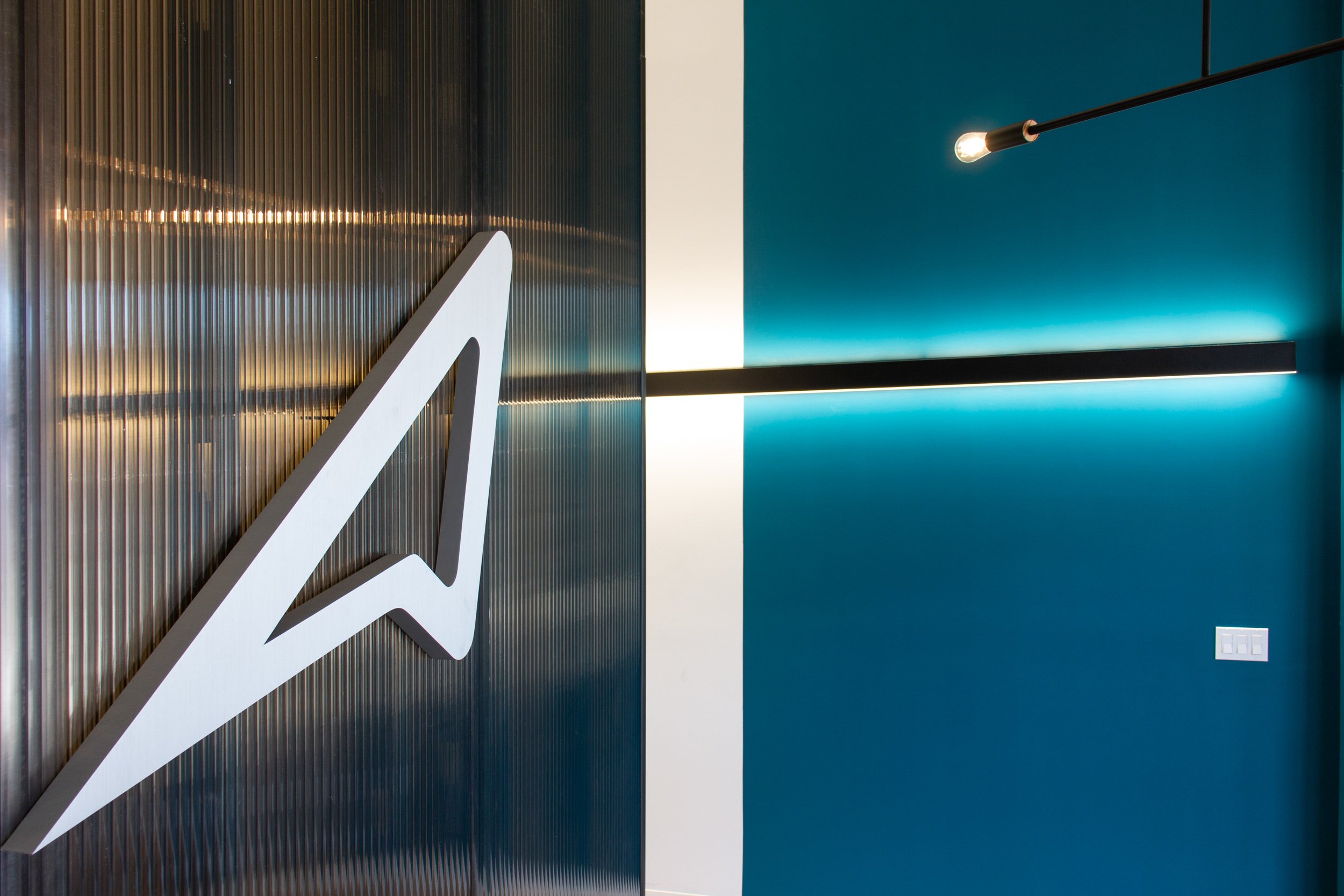
Working closely with the owner to understand the approachable setting of a stretch session at Reach, Synecdoche centered the design and brand around a welcoming color palette with an athletic tone. The primary blue/green tone, used to induce themes of wellness, is balanced with an industrial style to promote activity and movement.

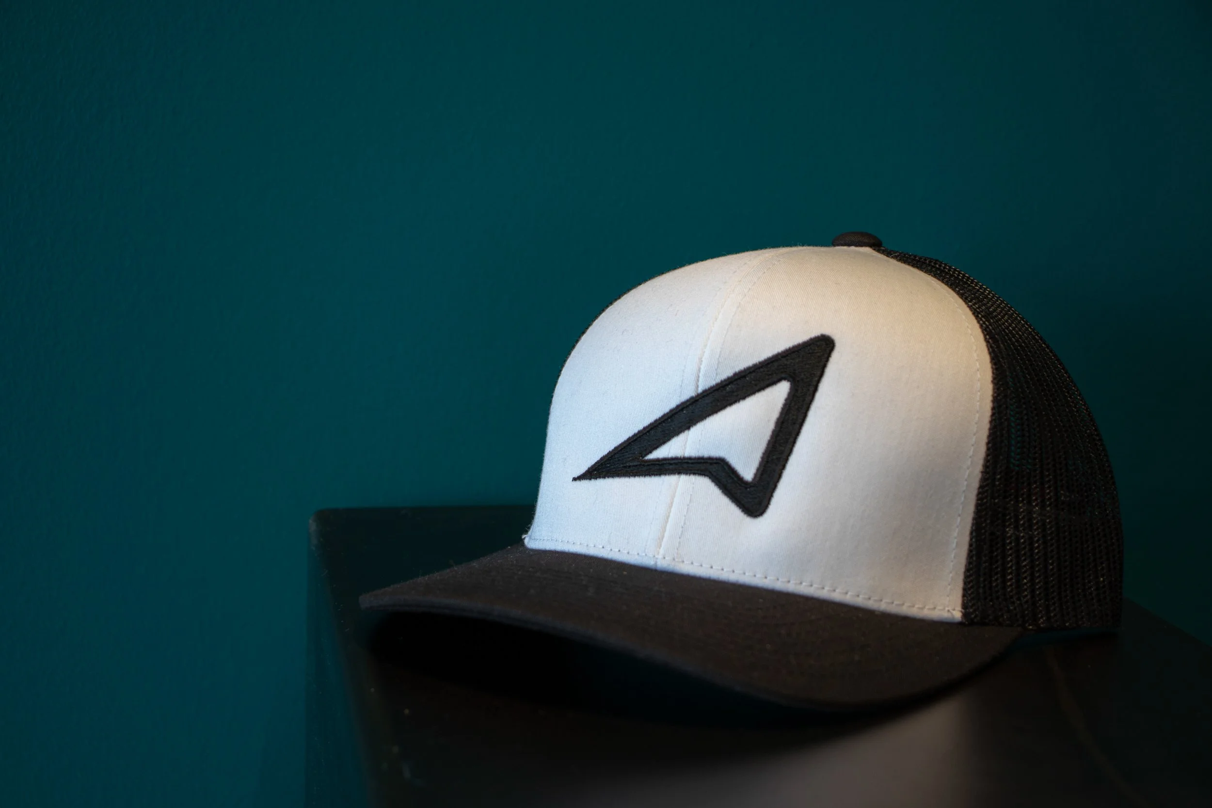
The sharp point defining the logo stretches, literally and figuratively, to the far left. The circular curves closing the loop contrast the angle in a relief from tension and stress.
The main logo combines acute angles and rounded corners to represent the core of what Reach Bodywork Studio has to offer.

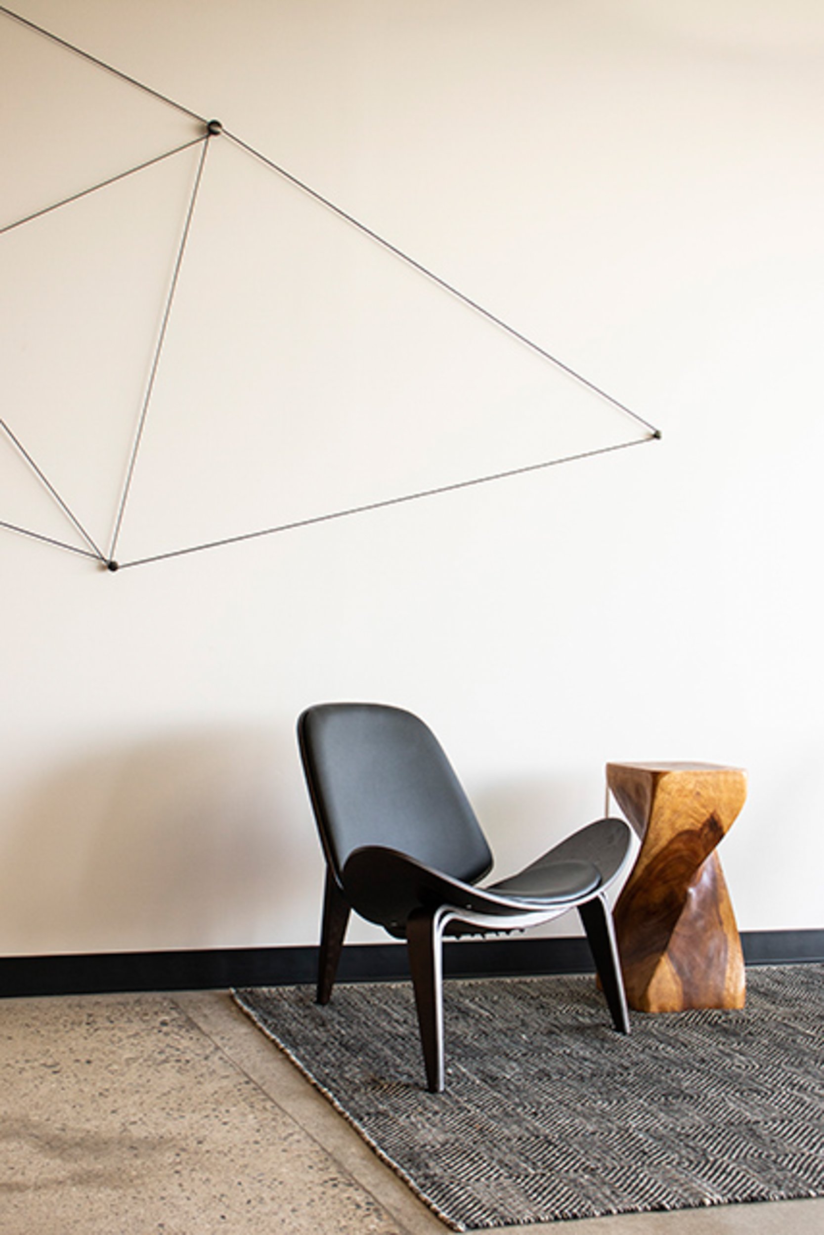
Notes of the brand carry over into the physical spaces as well, informing design, color, and spatial layout decisions.